I’ve always liked to test different things/tools to see what I could get out of them for personal or professional use.
On the occasion of the arrival of our 3rd child, we started looking for the best name.
I had “played” with Power BI several times in my previous life, in particular to build the Wavestone CyberBenchmark. So why not try again?
What already exists
Obviously, the visualization of the first names given during the last decades, is absolutely not revolutionary. There are already a lot of sites that propose :
- Analyses of first names with origin, sensitivity etc.
- Graphs of distribution by year
- Top 10 female and male names
But no dashboard satisfied me to see the evolution of a name by year, by department and by derived names.
The data source
If you want to analyze data on the landscape of first names in France, there are not multiple solutions. The INSEE (French National Institute of Statistics and Economic Sciences), provides two databases on data.gouv.fr :
- The detail of the first names given by year and by department (~75Mo): dpt2020.csv
- A synthesis of the first names given by year (2Mo): nat2020.csv
Two important points to keep in mind:
- The “Rare Names”, given less than 20 times since 1900, are grouped in “_PRENOMS_RARES” by year
- The first names not commonly given, less than 3 times per year and per department in the first case are grouped
The analyses thus constructed are therefore partly limited because there are 7M births of uncommon names, ~8% of the total number of the births.
The final visual
The result is as follows:
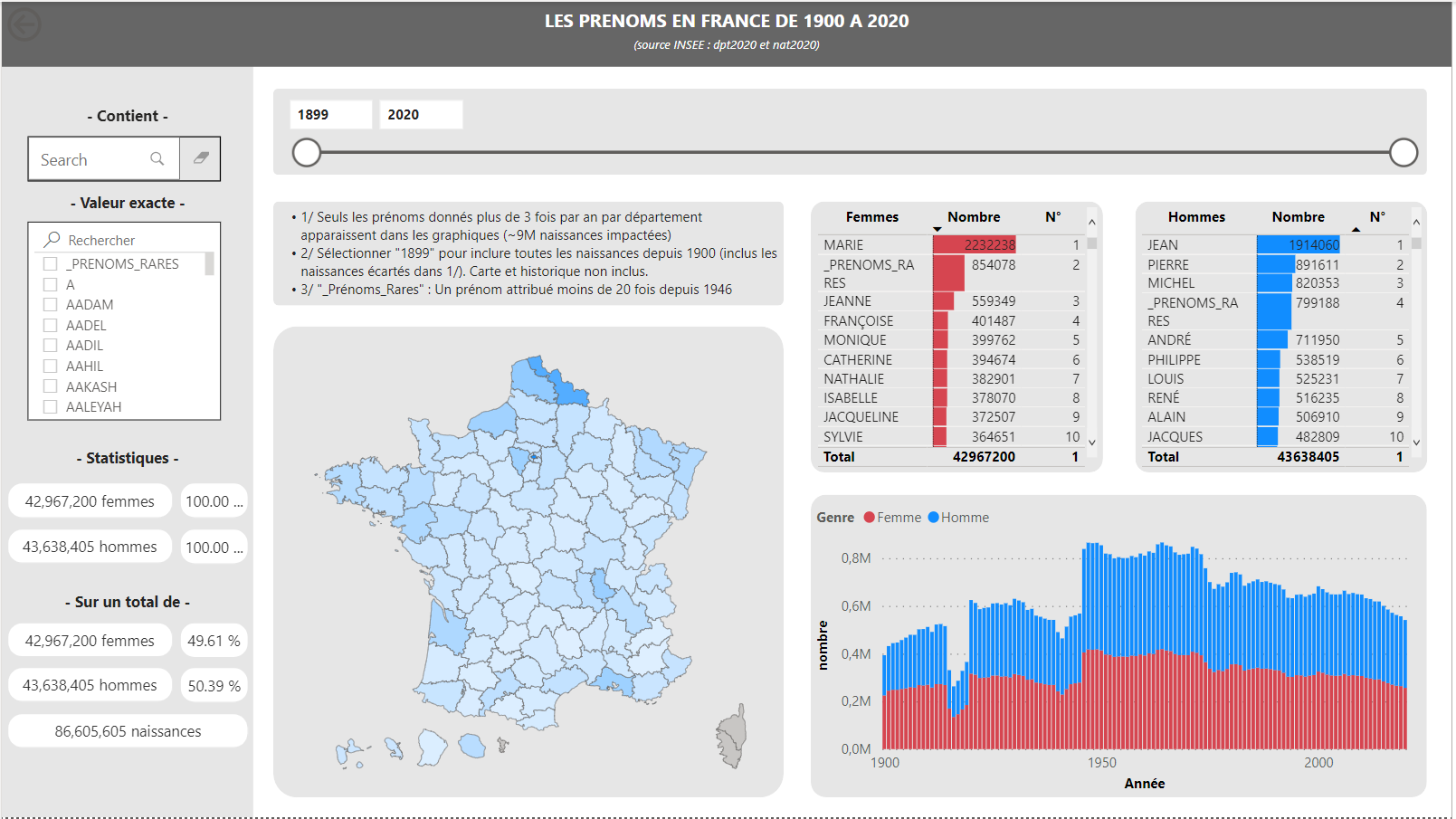
Note : In order to visualize the evolution of the uncommon names (for recall given less than 3 times in the year), I cheated a little by grouping them in the year 1899. This allows to have the total number of first names.
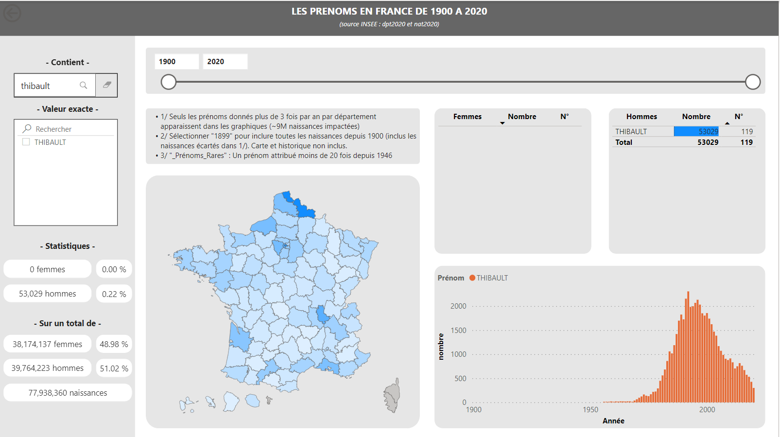
I can filter on a first name (ex: “Thibault”):
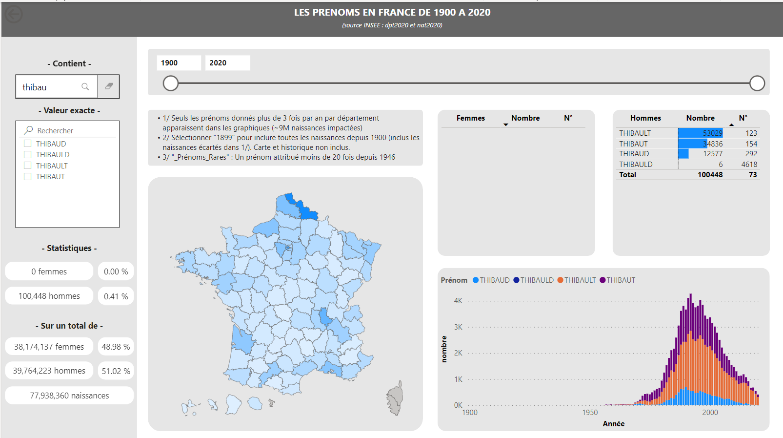
Or on derived first names (ex: “Thibau”):
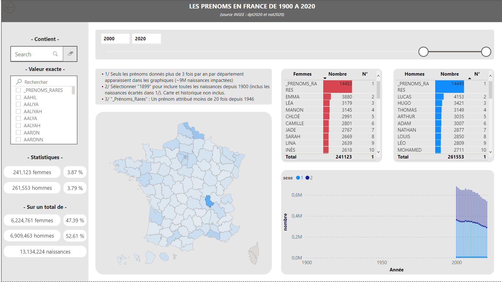
Or search on a time range and / or a department:
The graphic rendering can be improved, but the results are there!
I shared the .pbix here and you can play with the report here.
Construction of the dashboard
Data recovery was easy.
To filter my data, I created 3 tables:
- Filter_Year : to filter per year
- Filter_Firstname : to filter by name
- Gender: to filter by male or female individual
The construction of the model is also very simple:
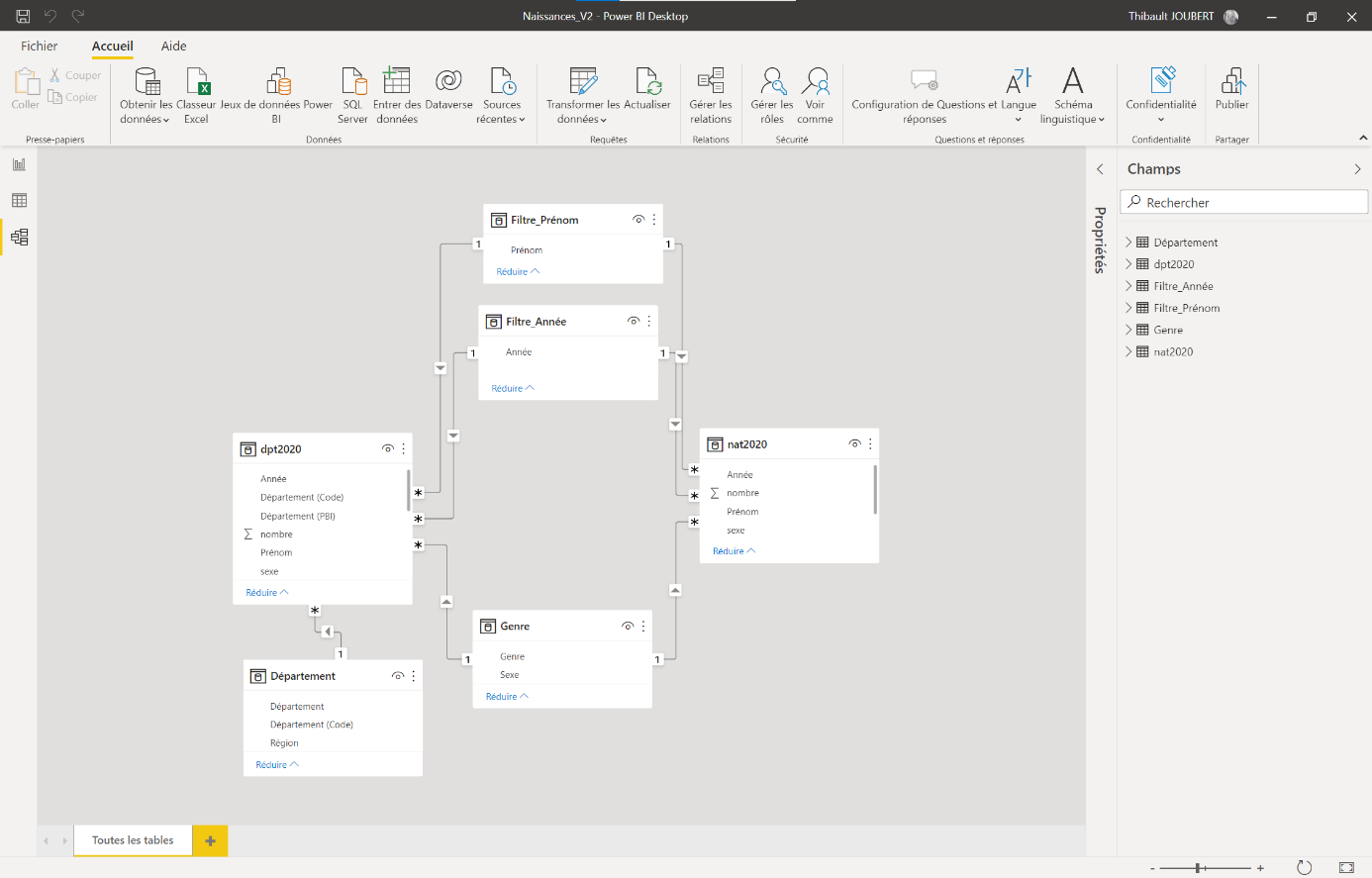
When constructing the charts, I ran into two problems:
- How to represent the data in the form of a map of France?
- How to have independent totals of some filters?
How to represent the data in the form of a map of France?
There is no native map with French departments in Power BI:
- The “ choropleth map” visual is quite complicated to use and is more used to compare proportion.
- The “Shape maps” preview would be a good solution, but Microsoft only offers the map of the regions of France, there is no departmental template.
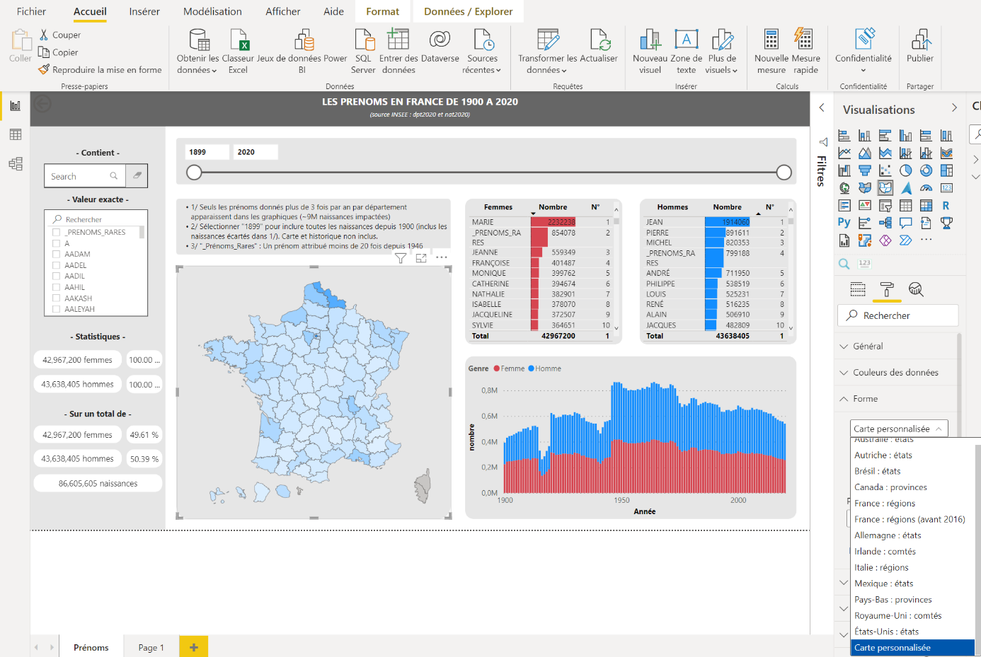
After some research, the solution was to import a custom Shape with a Shap maps visual:
Step 1: Retrieving the map of France in GeoJSON format (source)
Step 2: Transformation of GeoJSON into TopoJSON, a Power BI compatible format (https://mapshaper.org/)
Step 3: Import the map in “Format > Shape > Custom Map” once the “shape map” visual is created in the report
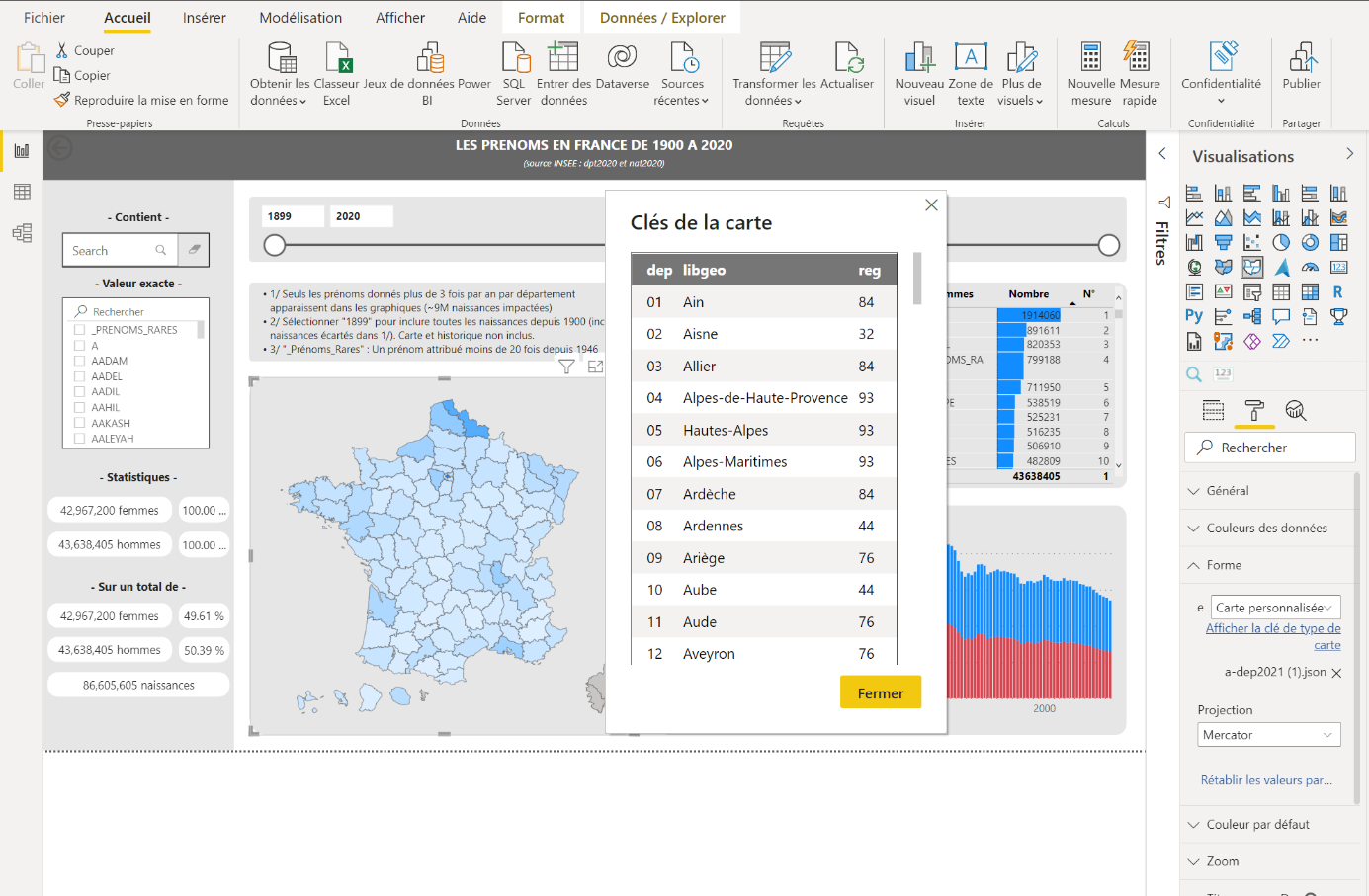
Step 4: Cleaning of the display names of the departments to ensure the correspondence between the INSEE database and the visual thus generated (see. Display the map type key)
How to have independent totals of some filters?
To enrich my dashboard, I added on the left a certain number of statistics to know in particular the number of boys or girls concerned by the research, compared to the total number of births in the region and the period.
The trick to not correlating the total numbers to the chosen names was to use the “Modify the interactions” feature in “Format”.
I can then specify for a filter (e.g., the search field for first names) that it has no impact on certain visuals, for example the three at the bottom left.
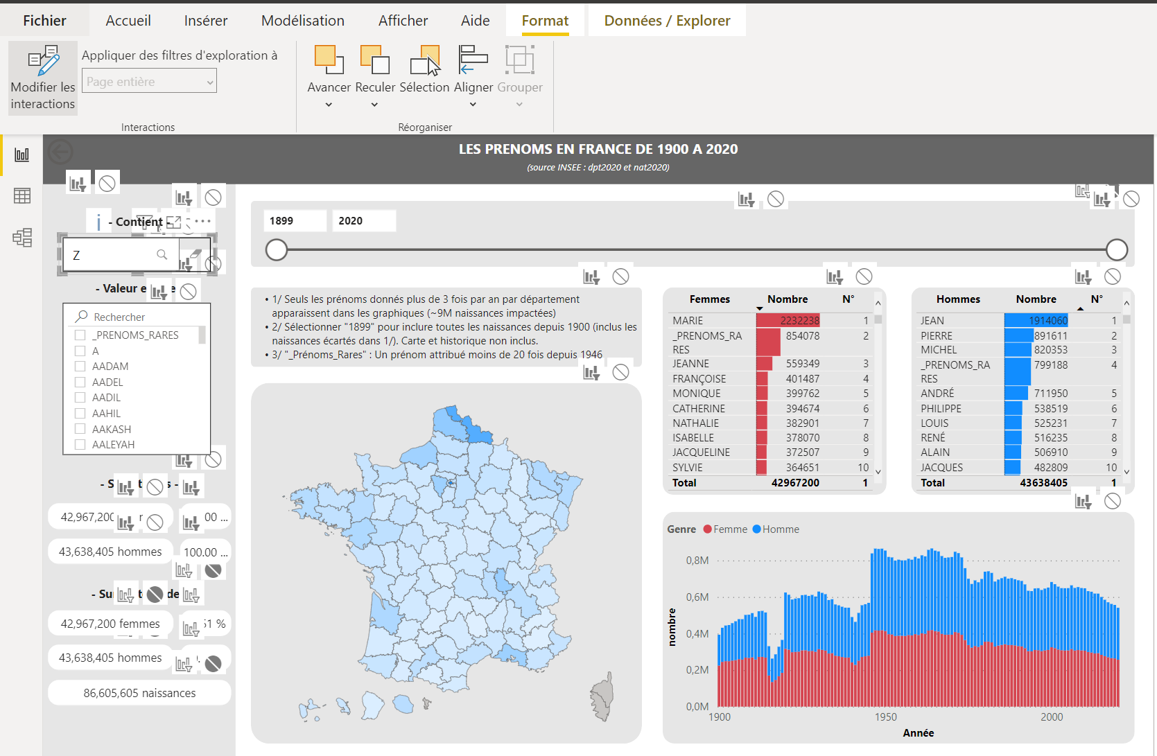
A very simple but useful setting.
Fun fact 1
By playing with the different filters (year, gender), I noticed that the proportion of births Female / Male had frankly evolved: from 54% of girls at the beginning of the 20th century to 46% today.
Fun Fact 2
We can see the evolution of the demography between the departments with big cities and those without:
| 1900 - 1910 | 2010-2020 | Developments | |
|---|---|---|---|
| Bouches-du-Rhône (13) | 91 648 | 221 676 | +142% |
| Cantal (15) | 27 319 | 1 951 | -1300% |
| Haute Loire (42) | 38 413 | 5 071 | -658% |
| Rhône (69) | 82 988 | 242 370 | +192% |